Making a Swipeable Deck of cards in React

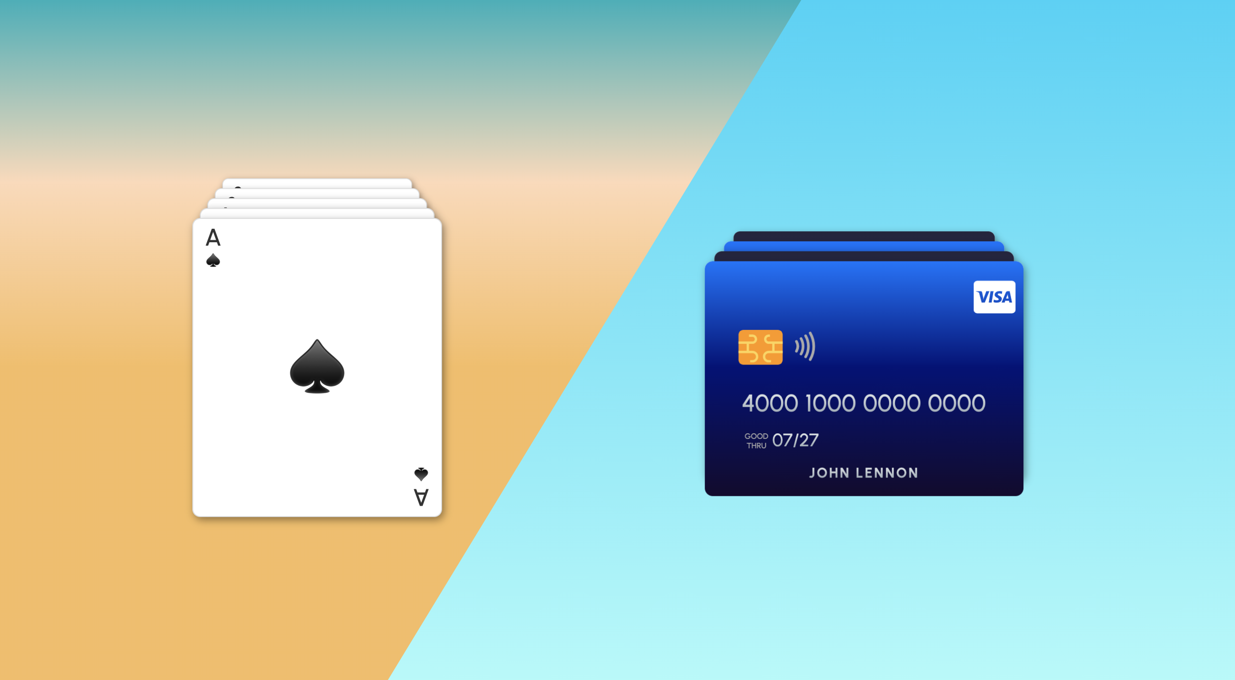
What we are building
The goal is that we can swipe the cards up and down, and they will cycle back and forth. We'll use framer/motion to control the animations and typescrypt to keep things tidy. This is what we are building:
Let's get started
First, we need to install the dependencies. Run the following command in an existing react project:
npm i framer-motionNow, let's create a new file called swipeable-deck.tsx and add the following code:
import React, { ReactNode, useState } from "react";
import { motion } from "framer-motion";
export type Card = {
id: number;
content: ReactNode;
};
type SwipeableDeckProps = {
deck: Card[];
className?: string;
};
export const SwipeableDeck = ({ deck, className }: SwipeableDeckProps) => {
return ()
}There we have the basic structure of our component. We have a Card type with an id and content (notice I used ReactNode instead of string so that we can use components if we want to). We also have our SwipeableDeck component that receives a deck prop which is an array of Card objects and an optional className.
Now let's add some basic markup to our component:
export const SwipeableDeck = ({ deck, className }: SwipeableDeckProps) => {
// The vertical padding between each card
const CARD_OFFSET = 10;
return (
<ul className={"deck " + (className || "")}>
{deck.map((card, index) => (
<li
key={card.id}
className="card"
style={{ zIndex: deck.length - index, top: index * -CARD_OFFSET }}
>
<div className="card-content">{card.content}</div>
</li>
))}
</ul>
);
};We will also need some styles. Create a new file called swipeable-deck.css and add the following code:
.card {
position: absolute;
display: flex;
flex-direction: column;
justify-content: center;
width: 250px;
height: 300px;
border-radius: 0.5rem;
border: 1px solid #ddd;
transform-origin: top center;
list-style: none;
background-color: white;
box-shadow: rgba(0, 0, 0, 0.4) 2px 3px 8px;
}
.deck {
position: relative;
width: 250px;
height: 300px;
margin-top: 64px;
}
.card-content {
font-weight: 300;
color: #333;
font-size: 1.5rem;
text-align: center;
vertical-align: middle;
}Then import the styles into our component:
import React, { ReactNode, useState } from "react";
import { motion } from "framer-motion";
import "./swipeable-deck.css";Let's add some cards
Now let's create a new file called index.tsx and add the following code:
import React from "react";
import { render } from "react-dom";
import { SwipeableDeck, Card } from "./swipeable-deck";
const cards: Card[] = [
{ id: 1, content: "Card 1" },
{ id: 2, content: "Card 2" },
{ id: 3, content: "Card 3" },
{ id: 4, content: "Card 4" },
{ id: 5, content: "Card 5" },
];
const App = () => {
return <SwipeableDeck deck={cards} />;
};
// assuming you have a div with id="root" in your index.html
render(<App />, document.getElementById("root"));How it looks so far
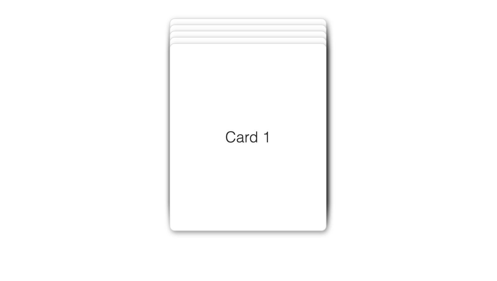
If you run your project, you should see a deck of cards stacked on top of each other. Now let's add the swipe functionality.
Enter framer-motion
First, let's add the motion component to our cards. Replace the li tag in the SwipeableDeck component with a motion.li tag.
Then we need to add the swipe functionality. We will use the drag property of the motion component to enable dragging on the y-axis and define an animation using the animate property. We will also add a dragConstraints property to limit the dragging to the y-axis.
export const SwipeableDeck = ({ deck, className }: SwipeableDeckProps) => {
const CARD_OFFSET = 10;
return (
<ul className={"deck " + (className || "")}>
{deck.map((card, index) => {
// Only the first card is draggable
const canDrag = index === 0;
return (
<motion.li
key={card.id}
className="card"
animate={{
zIndex: deck.length - index,
top: index * -CARD_OFFSET
}}
drag={canDrag ? "y" : false}
dragConstraints={{
top: 0,
bottom: 0,
}}
>
<div className="card-content">{card.content}</div>
</motion.li>
)})}
</ul>
);
};Still not swiping
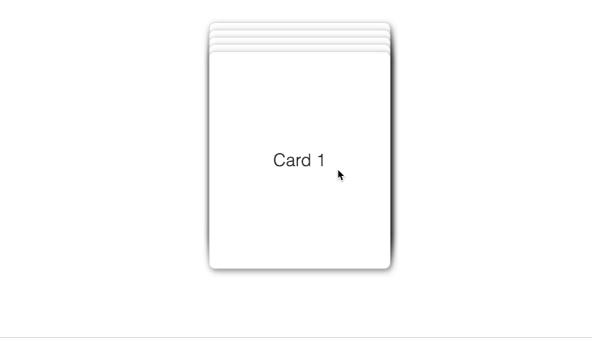
If you run your project now, you will see that the first card is draggable, but it doesn't move back to the bottom of the deck. To fix this, we need to add some logic to handle the dragging.
Handling swipes
We will add an onDragEnd event handler to the motion.li component. This handler will check if the card was dragged past a certain threshold and if so, it will move the card to the bottom of the deck.
For framer to animate the change, we need to change the order of the cards in the deck. For that we will introduce a new cards state variable and a move function to move the cards around.
Here's the final code:
import React, { ReactNode, useState } from "react";
import { motion } from "framer-motion";
export type Card = {
id: number;
content: ReactNode;
};
type SwipeableDeckProps = {
deck: Card[];
};
export const SwipeableDeck = ({ deck, className }: SwipeableDeckProps) => {
const CARD_OFFSET = 10;
// add a sense of perspective
const SCALE_FACTOR = 0.06;
const [cards, setCards] = useState<Card[]>(deck);
function move(
array: any[],
fromIndex: number,
toIndex: number,
on = 1
): any[] {
const newArray = array.slice(); // Create a shallow copy of the array
const movedElements = newArray.splice(fromIndex, on); // Remove the elements to move
newArray.splice(toIndex, 0, ...movedElements); // Insert the removed elements at the new index
return newArray;
}
const moveToEnd = (info: any, from: number) => {
if (info.offset.y < 0) {
setCards(move(cards, from, cards.length - 1));
} else {
setCards(move(cards, cards.length - 1, from));
}
};
return (
<ul className={"deck " + (className || "")}>
{cards.map((card, index) => {
const canDrag = index === 0;
return (
<motion.li
key={card.id}
className="card"
style={{
cursor: canDrag ? "grab" : "auto",
}}
animate={{
top: index * -CARD_OFFSET,
scale: 1 - index * SCALE_FACTOR,
zIndex: deck.length - index,
}}
drag={canDrag ? "y" : false}
dragConstraints={{
top: 0,
bottom: 0,
}}
onDragEnd={(event, info) => moveToEnd(info, index)}
>
<div className="card-content">{card.content}</div>
</motion.li>
);
})}
</ul>
);
};
We added a generic move function that moves array elements between specific indexes. We also added a moveToEnd function that moves the card to the end of the deck and hooked it up to the onDragEnd event handler.
To decide whether to move the card to the end of the deck or back to the top, we check the offset.y property of the info object passed to the onDragEnd event handler. If the offset.y is negative, we move the card to the end of the deck, otherwise, we move it back to the top.
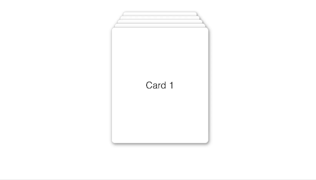
Finally working
Customizing the deck
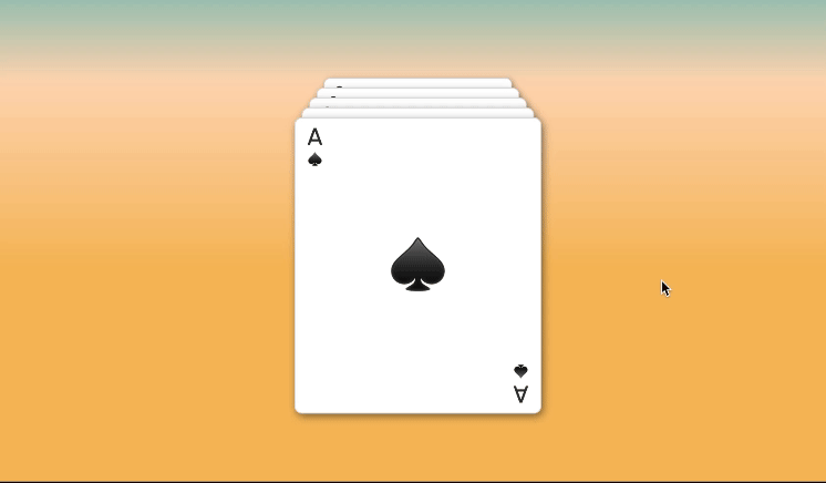
Remember we can pass React components as Cards? Let's give it a try by creating a new component called PokerCard in our index.tsx file.
import "./index.css"
type PokerCardProps = {
number: string;
suit: string;
};
function PokerCard({ number, suit }: PokerCardProps) {
return (
<div className="poker-card">
<div className="top">
<div>{number}</div>
<div className="suit">{suit}</div>
</div>
<div className="center">{suit}</div>
<div className="bottom">
<div>{number}</div>
<div className="suit">{suit}</div>
</div>
</div>
);
}And let's update our cards array to use the PokerCard component.
const CARDS: Card[] = [
{
id: 1,
content: <PokerCard suit="♠️" number="A" />,
},
{
id: 2,
content: <PokerCard suit="♥️" number="A" />,
},
{
id: 3,
content: <PokerCard suit="♦️" number="A" />,
},
{
id: 4,
content: <PokerCard suit="♠️" number="3" />,
},
{
id: 5,
content: <PokerCard suit="♦️" number="3" />,
},
];Finally let's create some styles for our PokerCard component.
.poker-card {
display: flex;
flex-direction: column;
justify-content: space-between;
padding: 0.25rem;
height: 100%;
font-weight: 500;
}
.poker-card .top {
width: 2rem;
text-align: center;
}
.poker-card .top .suit,
.poker-card .bottom .suit {
font-size: 14px;
}
.poker-card .center {
text-align: center;
font-size: 3.5rem;
}
.poker-card .bottom {
width: 2rem;
text-align: center;
float: right;
align-self: self-end;
margin-bottom: 0.5rem;
transform: rotate(180deg);
}And that's it! You can now run your project and see the PokerCard component in action.
Bonus
With a few more tweaks you can make a credit card stack as well. Here's an example: